Work / 02 — Fintech · Web
Vodafone Pay — Product Microsite
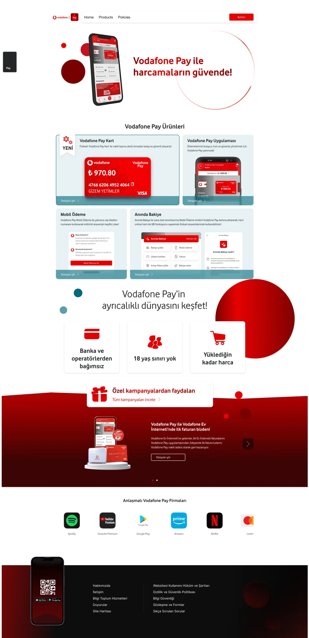
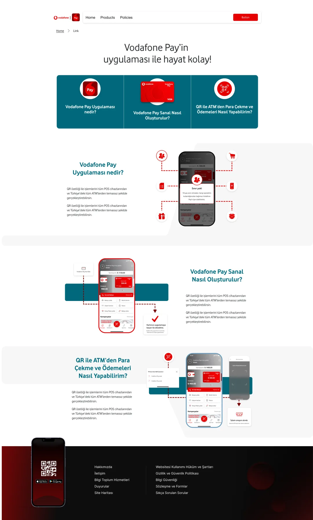
Responsive UI and component design for Vodafone Pay's product pages — modular blocks, tutorial-style “how it works” visuals, and lightweight micro-interactions that keep dense information digestible.
- Role
- UX/UI Designer
- Platform
- Web (responsive)
- Scope
- Modular content blocks, “how it works” step visuals, micro-interactions
- Client
- Vodafone
Case study
Summary
Vodafone Pay needed product pages that do two jobs at once: sell the ecosystem — what it includes, why it matters — and teach people how it actually works (QR payments, ATM withdrawal, top-ups). The core challenge was density: a lot of information, without overwhelming the user.
Approach
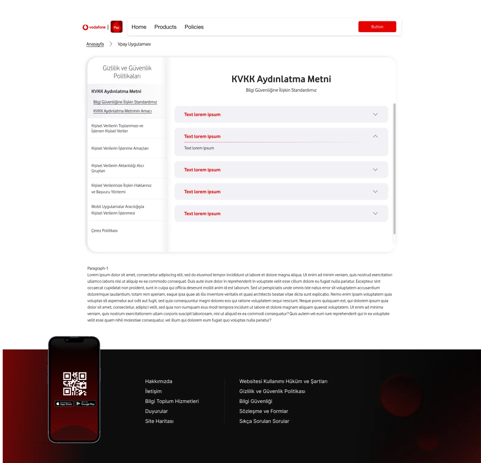
A tutorial-like layout built on progressive disclosure, so dense content reveals in digestible steps rather than all at once. Long legal / KVKK content was made scannable through accordion patterns and anchored side navigation.
What I designed
- Homepage / product overview from modular content blocks that recompose across breakpoints.
- “How it works” sections using step-by-step, tutorial-style composition for QR, ATM withdrawal, and payments.
- Policy / KVKK pages made scannable through accordion patterns plus anchored side navigation.
- Micro-interactions — accordion, hover / scroll cues, and lightweight motion.
Outcome
A microsite that balances marketing clarity and user understanding, with a reusable component approach that keeps the dense product ecosystem digestible across devices.