Work / 04 — Web · Responsive
Vodafone — Landing Pages
UI and component design for Vodafone's responsive campaign landing pages — visual hierarchy, reusable discovery components, and conversion CTAs that deep-link into the Vodafone App with store fallback.
- Role
- UX/UI Designer
- Client
- Vodafone Turkey
- Platform
- Web (responsive)
- Scope
- Visual hierarchy, reusable components, micro-interaction, conversion CTAs
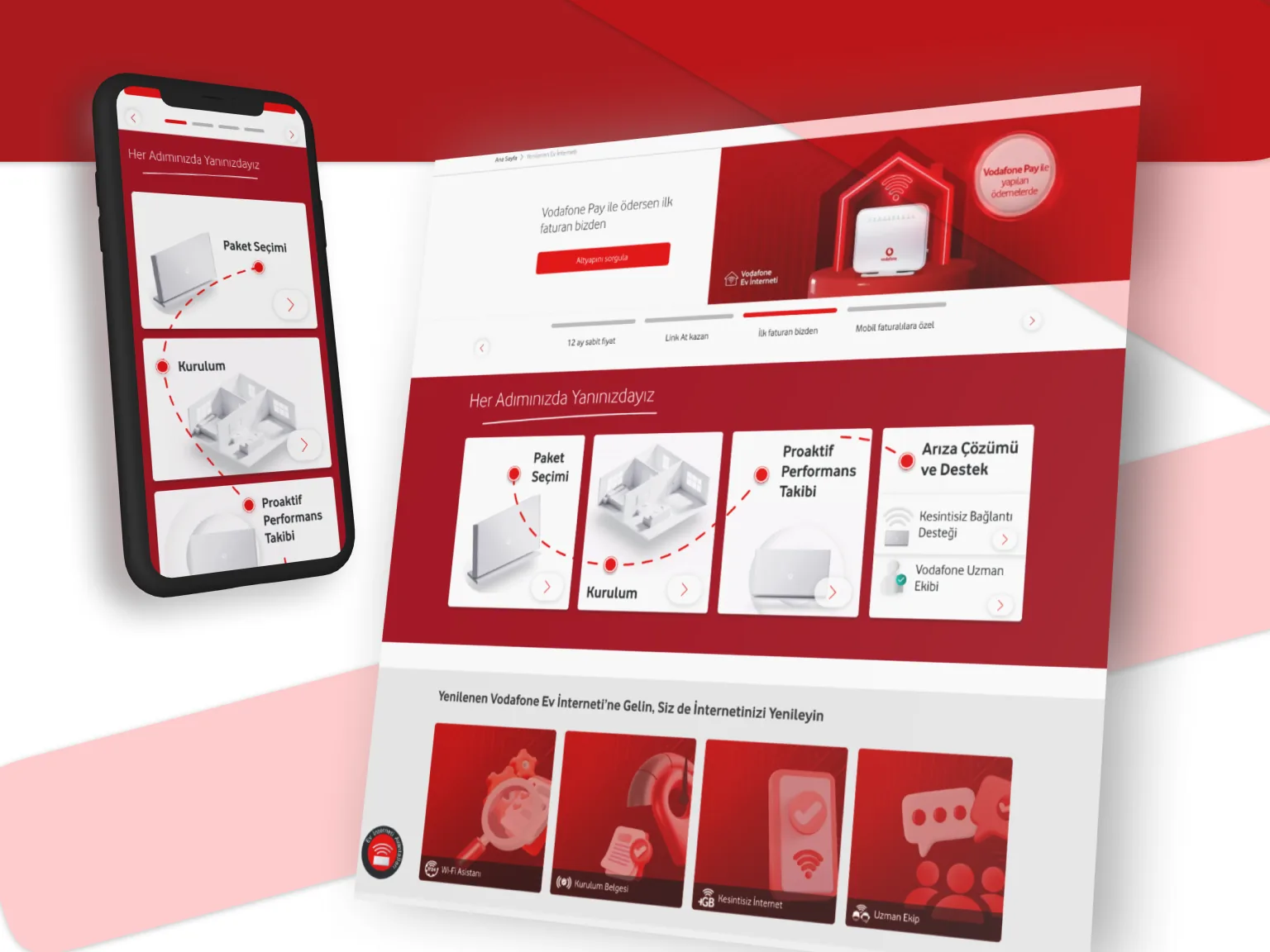
Residential — home internet
A landing page that narrates the post-purchase journey for Vodafone home internet — walking customers through what happens after they buy, and showing that support continues at every step.
A step component (Paket Seçimi → Kurulum → Proaktif Performans Takibi → Arıza Çözümü) narrates the journey through progressive disclosure.
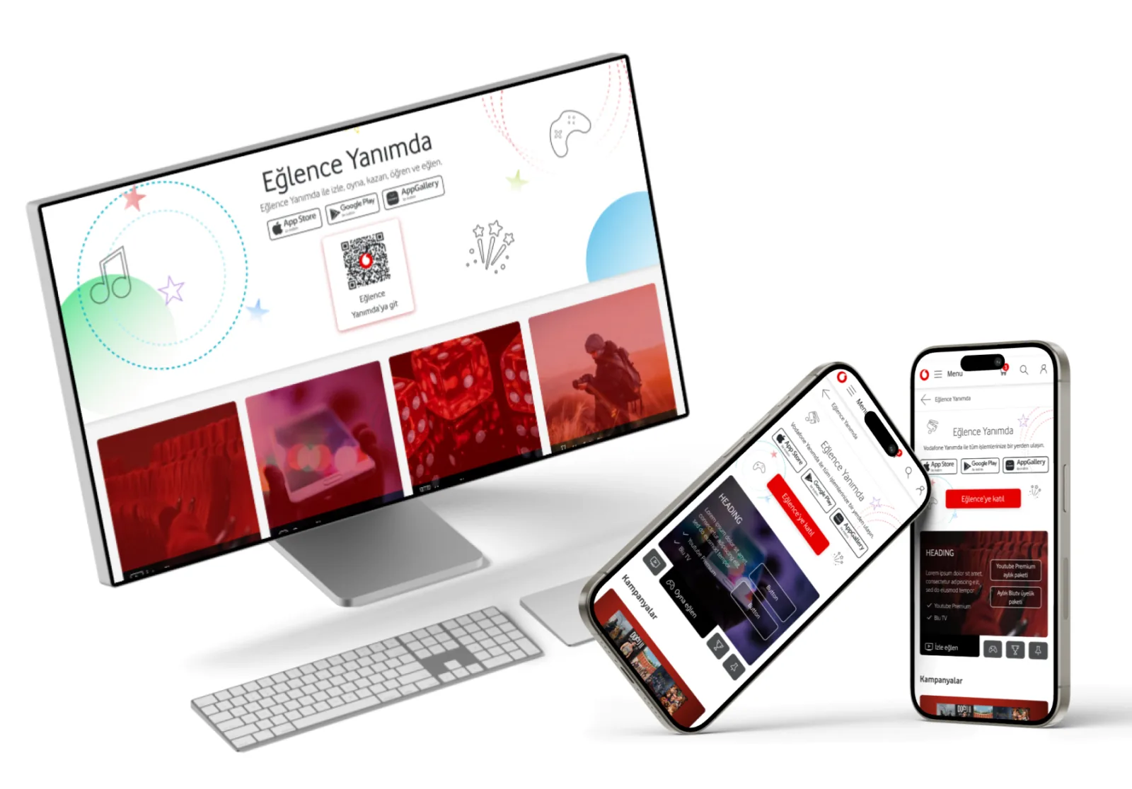
Eğlence Yanımda — “Fun is with Me”
A landing page presenting Vodafone's entertainment sub-services and leading customers into the Vodafone App to activate them.
Discovery cards surface each sub-service, with conversion CTAs and deep-links to the app plus a store fallback.
One reusable card component
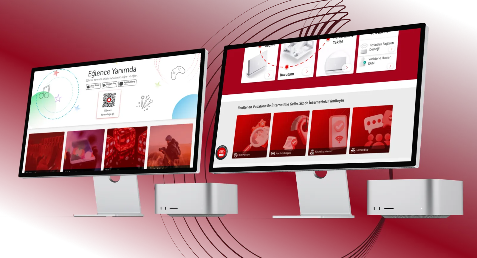
A single flexible card component, designed to adapt across layouts and content — deployed as a 4-card variant on the Residential LP (Wi-Fi Asistanı, Kurulum Belgesi, Kesintisiz İnternet, Uzman Ekip) and a 3-card variant on Eğlence Yanımda (Dijital Üyelikler, Oyunlar, Dijital Servisler). Same structure, different counts and content.
Case study
Problem
Vodafone's campaign pages needed to communicate multi-step services and varied sub-offerings clearly, then convert — moving users toward the next action (support, or activating a service in the app) without dumping everything on them at once.
Approach
I led each page with visual hierarchy and progressive disclosure so the message unfolds in digestible steps. Rather than one-off blocks per page, I built reusable, configurable components — the step narration and the discovery card — so the same structure could carry different content and counts across campaigns.
Outcome
Two campaign pages that stay clear under dense content, built on reusable components that carried across campaigns and reduced repeat design work — and are still live on Vodafone's site.