Work / 09 — Case study · Mobile
Biletix — Ticketing Redesign
Redesign of a ticketing app focused on discovery, purchasing, and ticket-usage flows — reworked around a shared component system for clarity and consistency.
- Role
- UX/UI Designer
- Type
- Concept redesign
- Platform
- Mobile (iOS / Android)
- Scope
- Design system, IA, screen redesign across critical flows
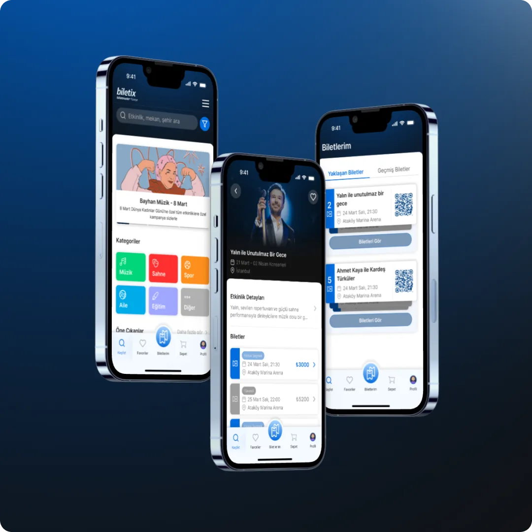
Redesign scope
Based on the identified key problem areas, the most critical parts of the user journey — discovery, purchasing, and ticket usage — were reworked. Screens expected to have the highest impact on the experience were included in the redesign scope.
Redesigned screens
- Home / Discover
- Category / Filtered listing
- Event detail
- Ticket selection / Seat selection
- Cart summary / Purchase entry
- My Tickets / Ticket detail
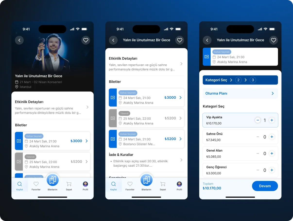
Simplifying the ticket selection & add-to-cart flow
The ticket selection flow was simplified to make the purchase journey more visible, clearly communicate selection states, and make each step of the buying process easier to understand.
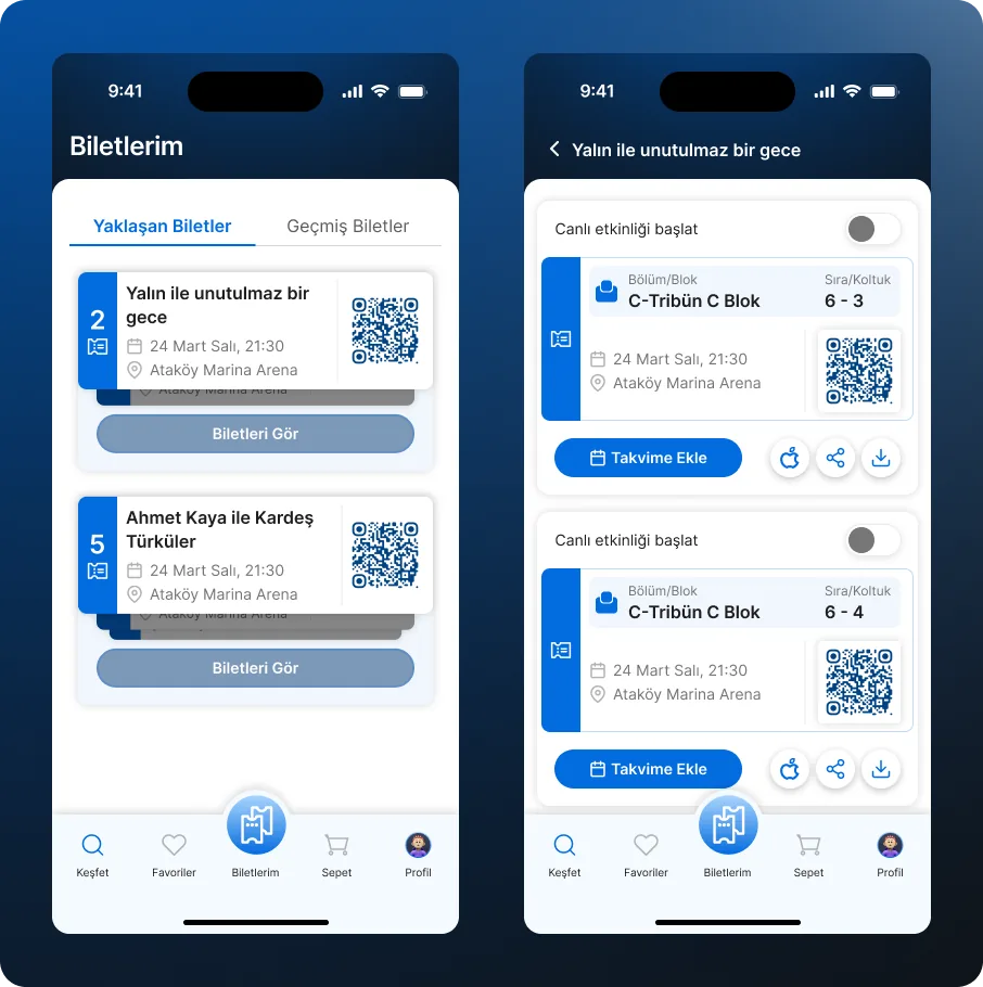
Making “My Tickets” more compact and usable
The goal was to let users view purchased tickets with less scrolling, access critical information more quickly, and simplify the event-day usage experience.
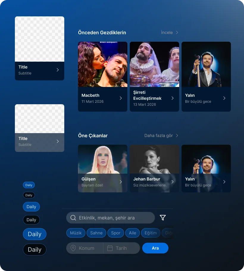
Design system approach
The proposals weren't only screen-based — they were handled through a shared component logic that supports consistency, readability, and task clarity across different flows.
Common UI patterns
- Card structure
- Filter / chip system
- Sticky summary area
- CTA hierarchy
- Information boxes / status areas
- Ticket summary component
Case study
Problem
Discovery was cluttered, ticket selection unclear, and users had to scroll too much in “My Tickets” to find what they needed. The purchase journey lacked visual clarity.
What I designed
- Redesigned Home / Discover with category-based browsing and event groupings.
- Simplified ticket selection with clear state communication.
- Compact “My Tickets” with quick access to critical information.
- A shared component system — cards, filters, sticky summaries, CTA hierarchy — across every screen.
Outcome
A clearer ticketing experience: users could discover events faster, understand their purchase options, and access tickets without friction.